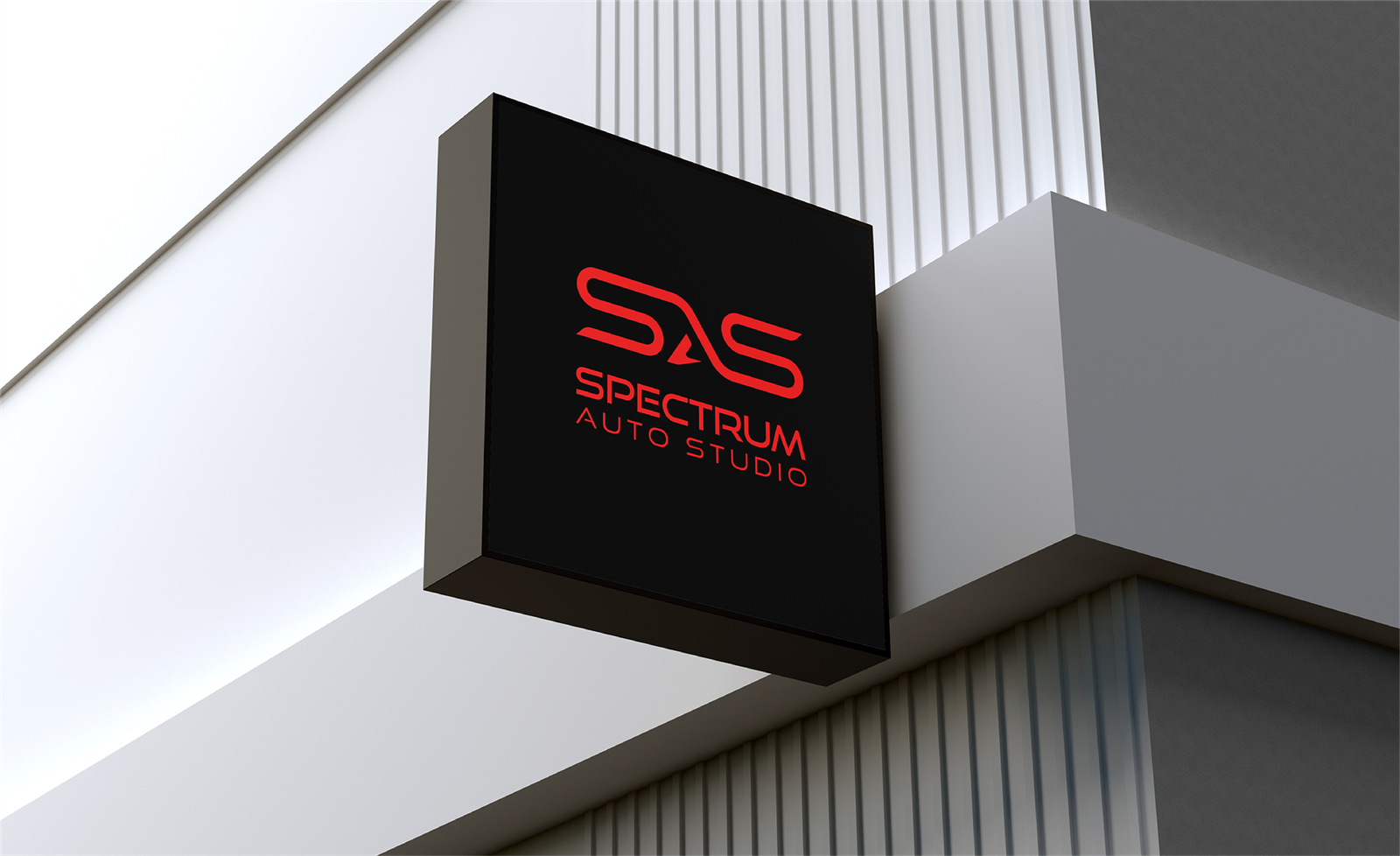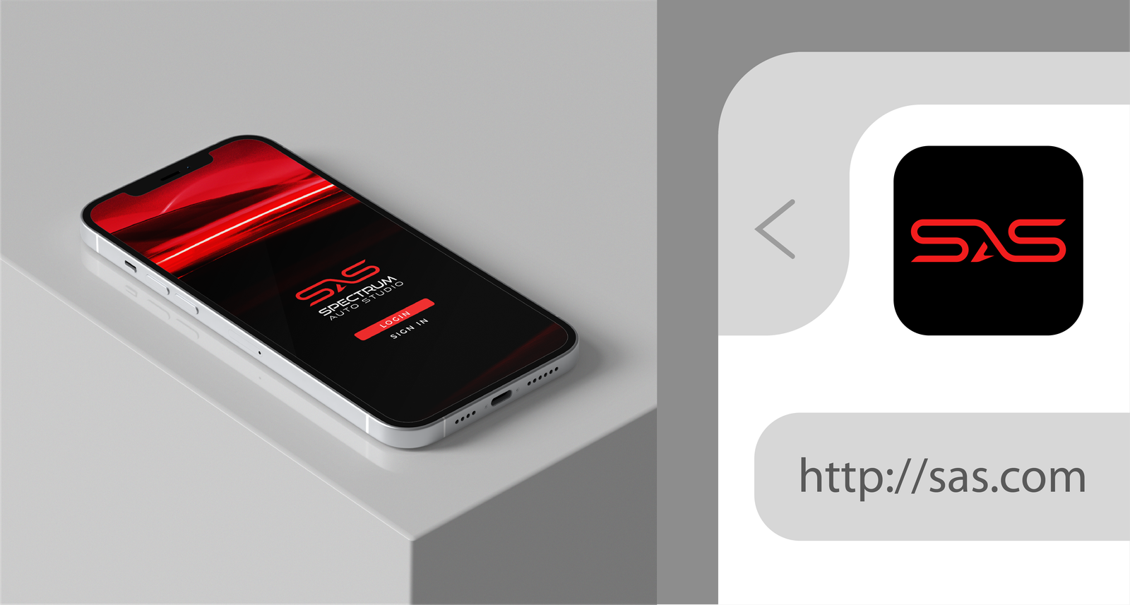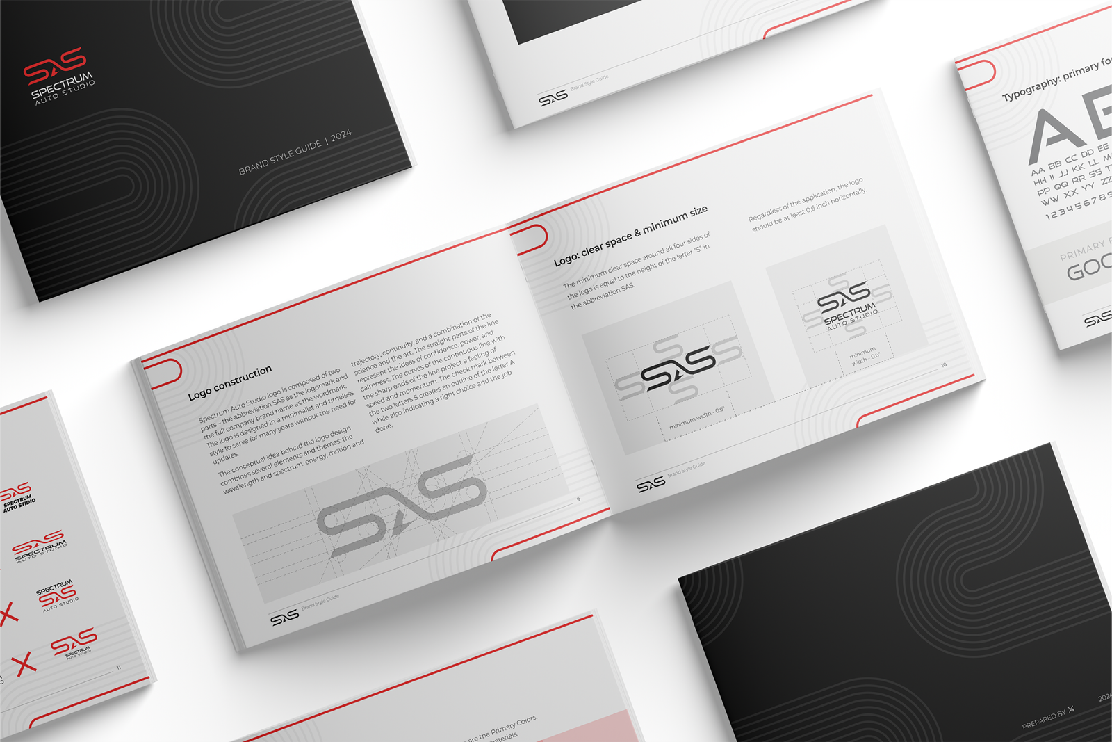
Logo design and branding.
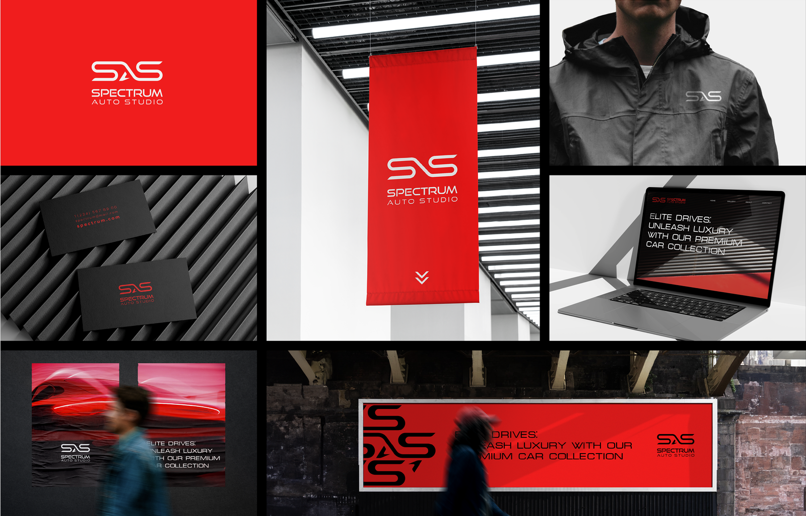
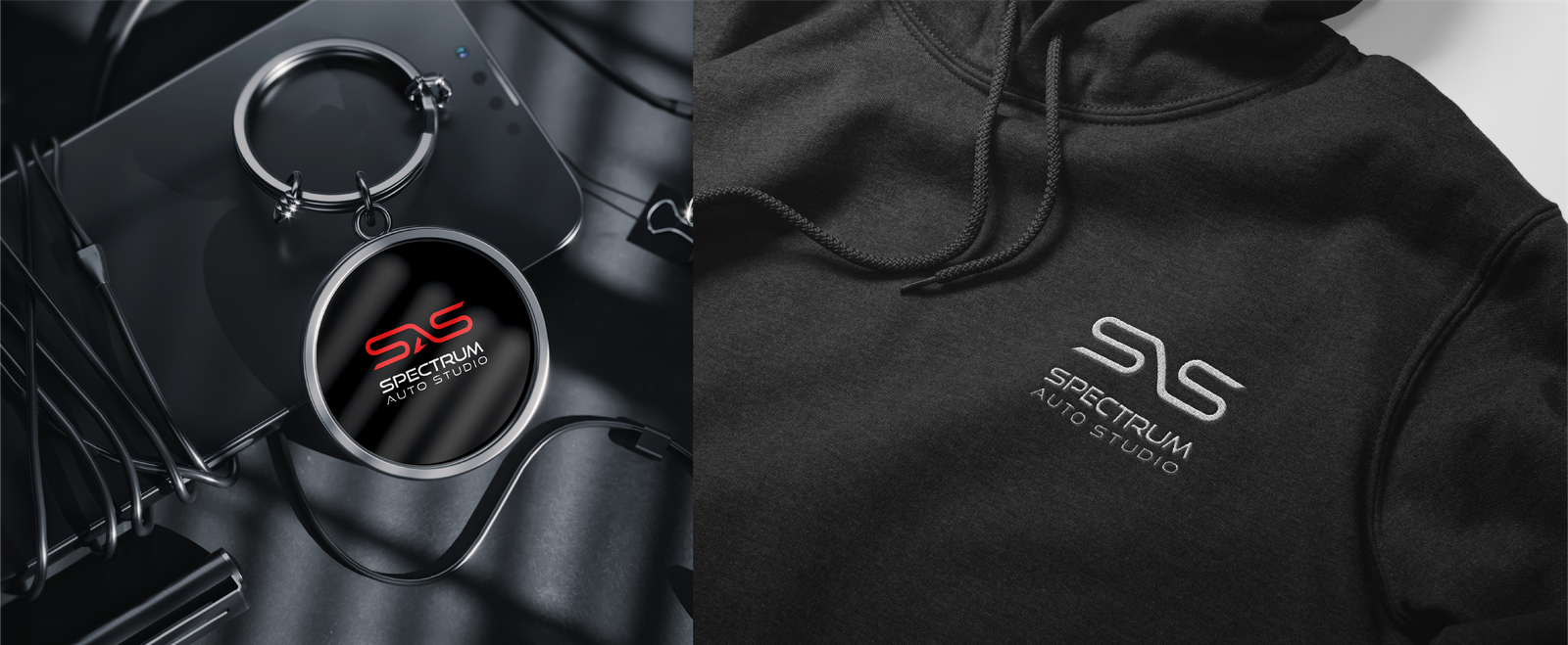
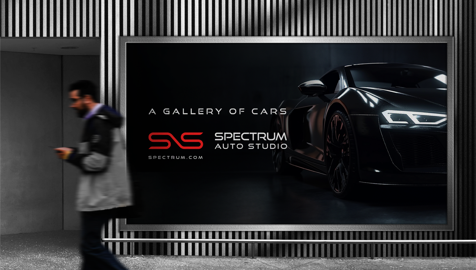
Spectrum Auto Studio is a high-end auto sales and car detailing business in Denver, Colorado. The business model is not a traditional car dealership, but a club for car enthusiasts. Nearly all customers come to the auto studio from social media platforms, car blogs, and the word-of-mouth. The brand identity needed to be modern, minimalist, sleek, and expensive.
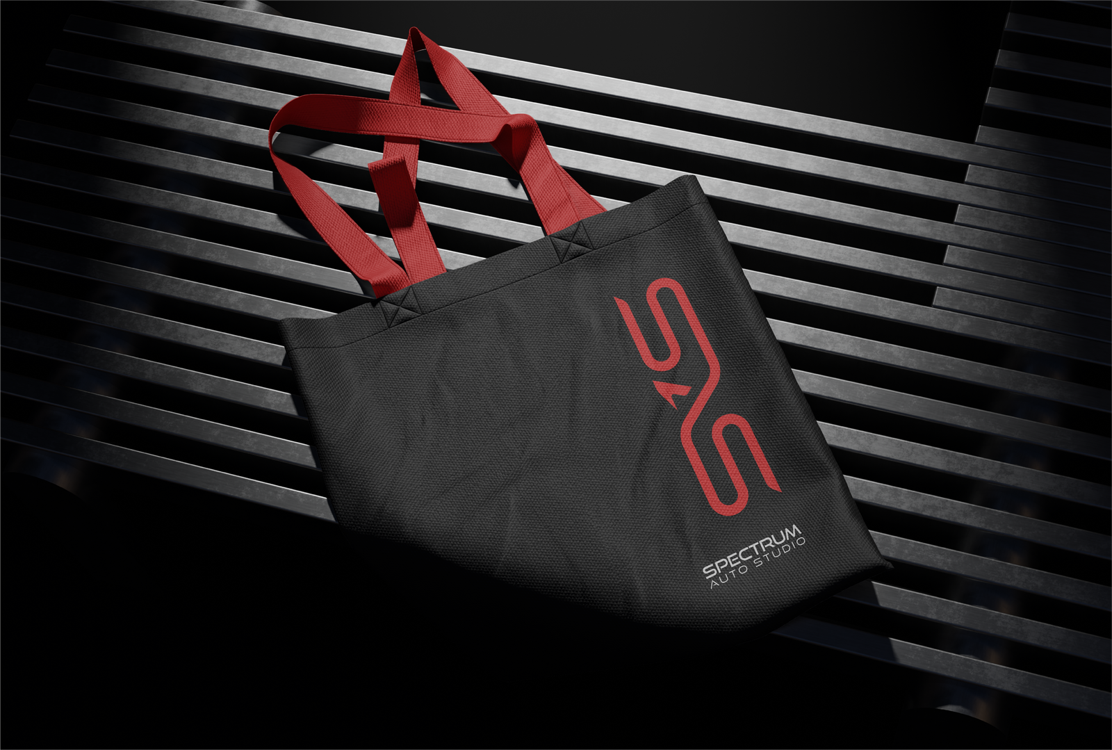
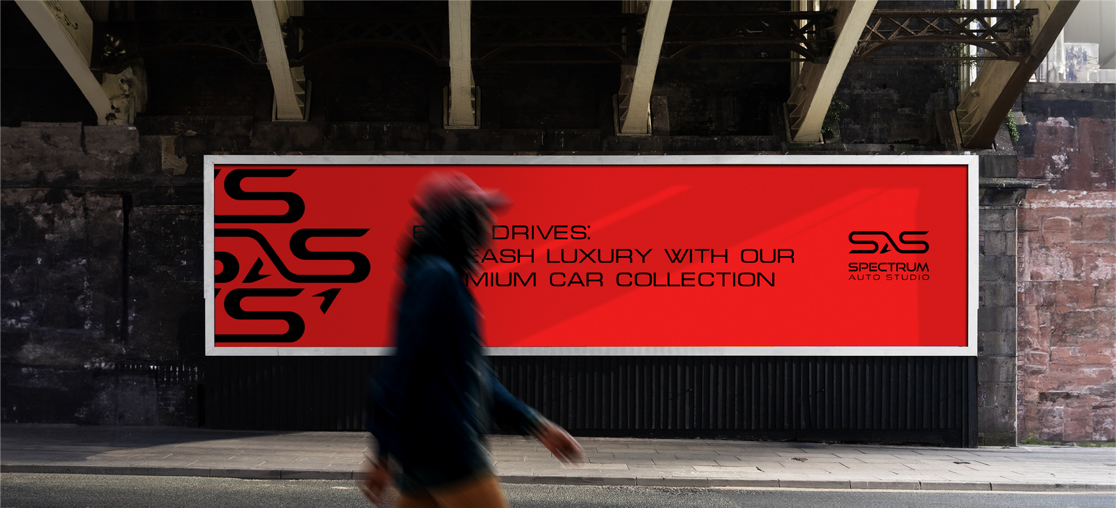
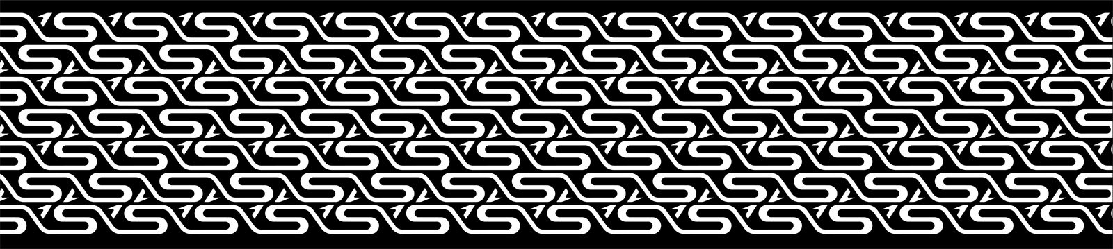
We designed the logo as a unique combination of stylized letters SAS that are created by one continuous line with sharp endpoints representing motion and curves of a racetrack. The two letters S are opposite mirror image of each other, creating a balance in the composition. The curves of the letters S represent continuous waves on the top going to the left and on the bottom, going to the right that creates a sense of mechanical revolution and continuity. The small checkmark creates a counter form letter A and carries a meaning of a right choice and a job well done.
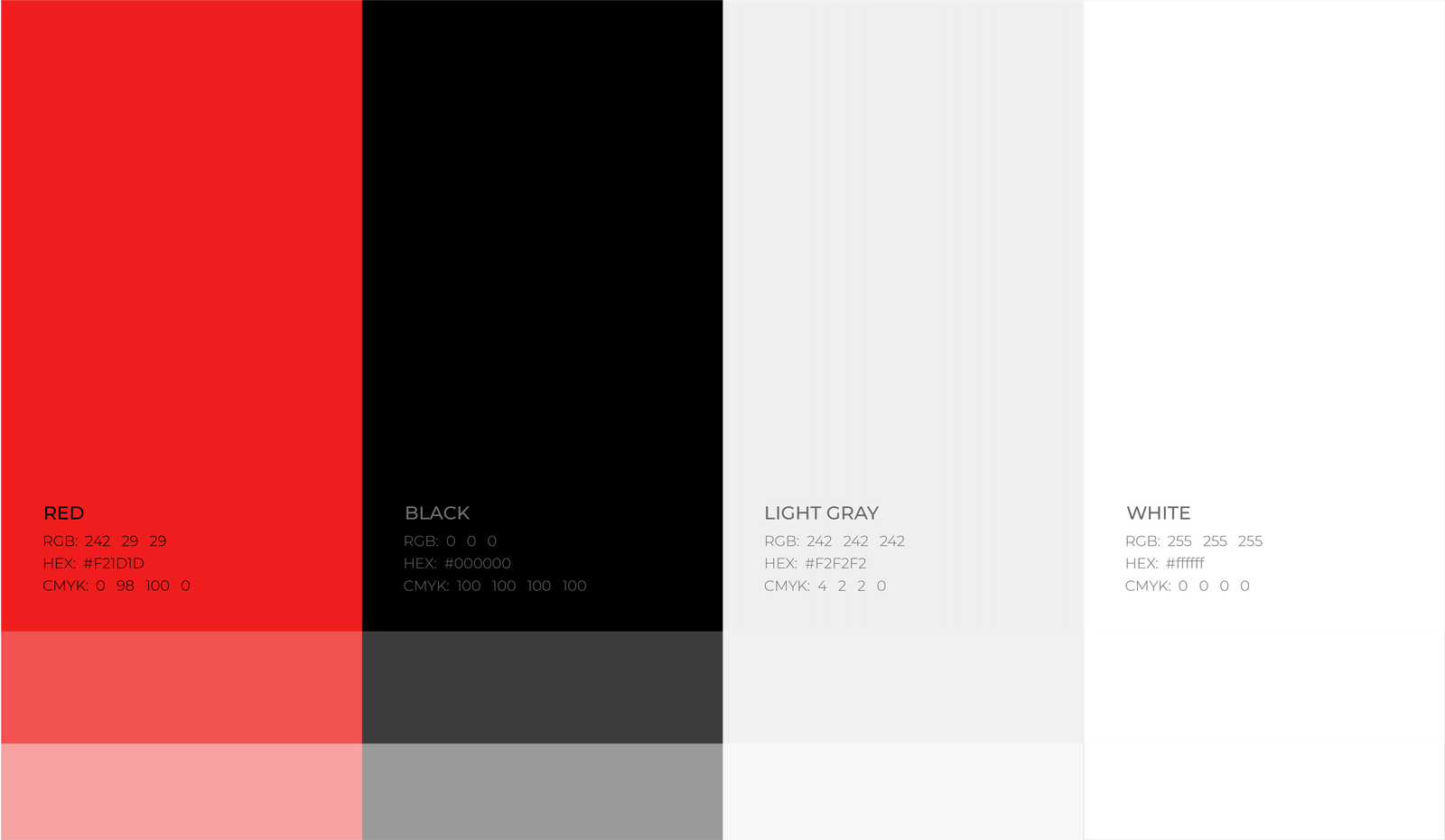
The main colors are black and red-orange (the color with the longest wavelength in the visible spectrum). The psychological meaning of the colors emphasizes energy, power, confidence, excitement, sophistication, and elegance.