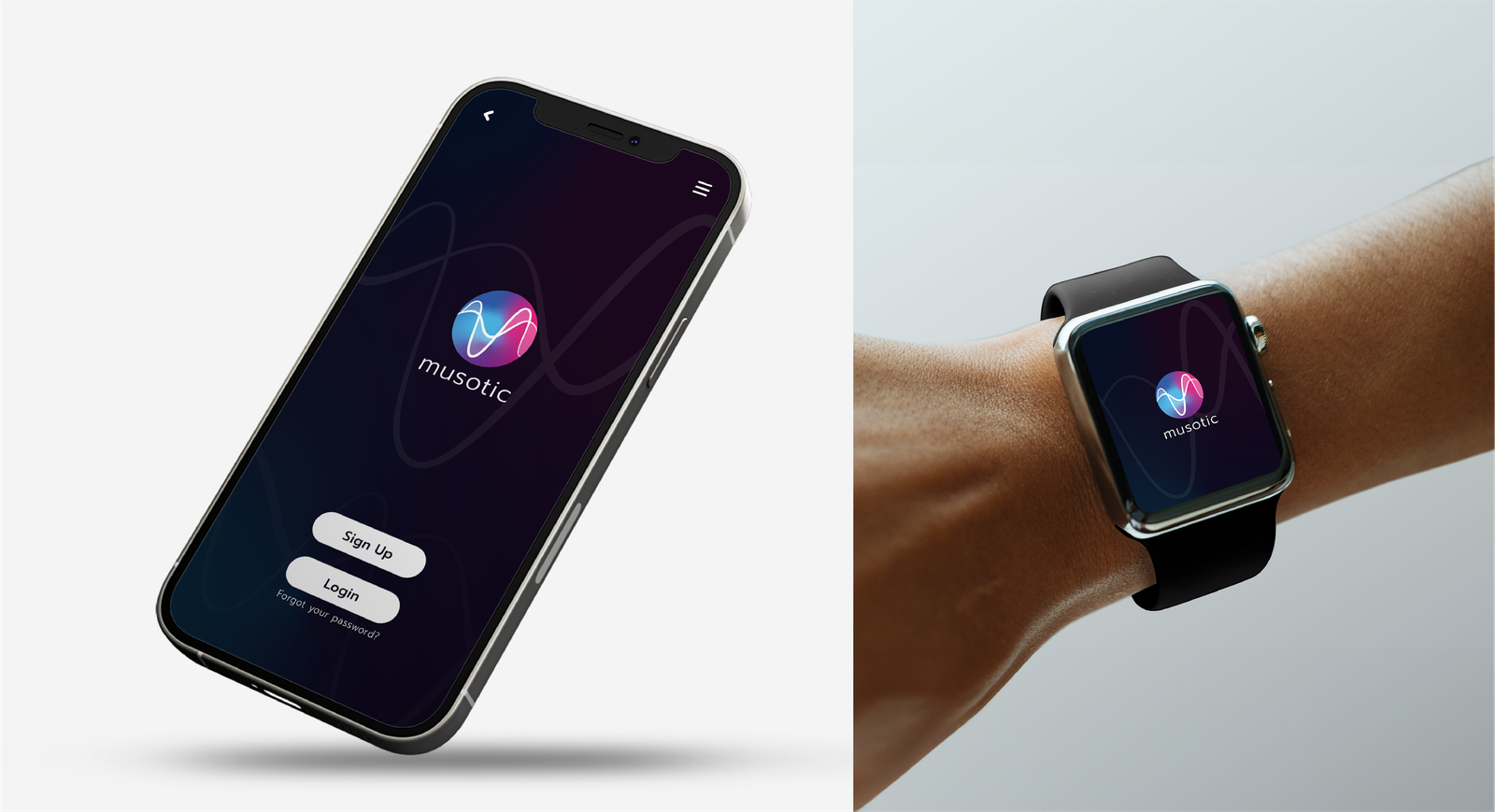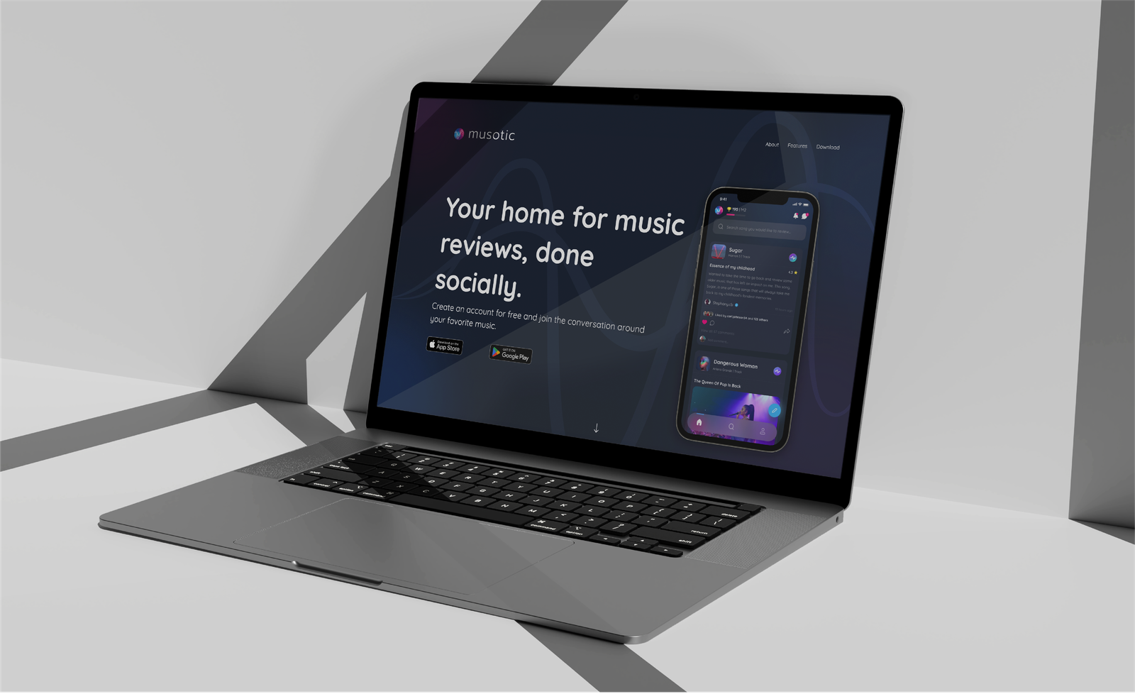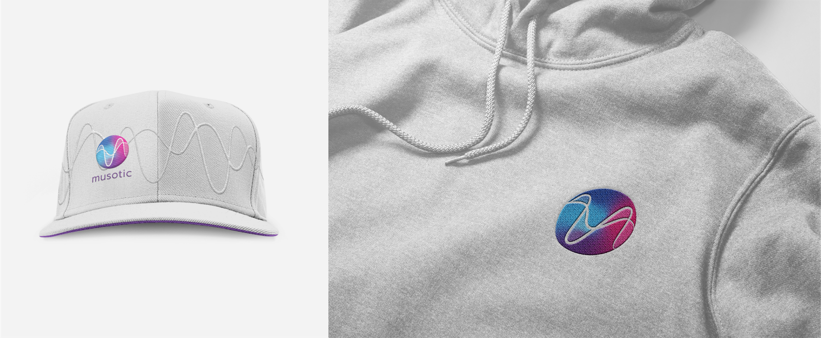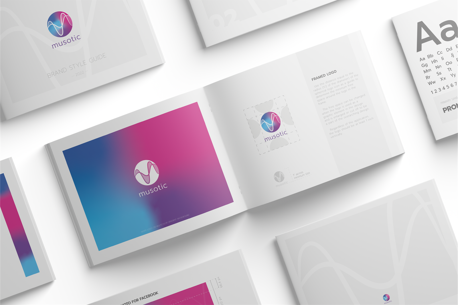
Welcome to Musotic – a new social media platform dedicated to connecting people through writing and sharing music reviews. The Los Angeles-based start-up needed a logo that would combine the themes of music and social connection – the two core components of the new brand.
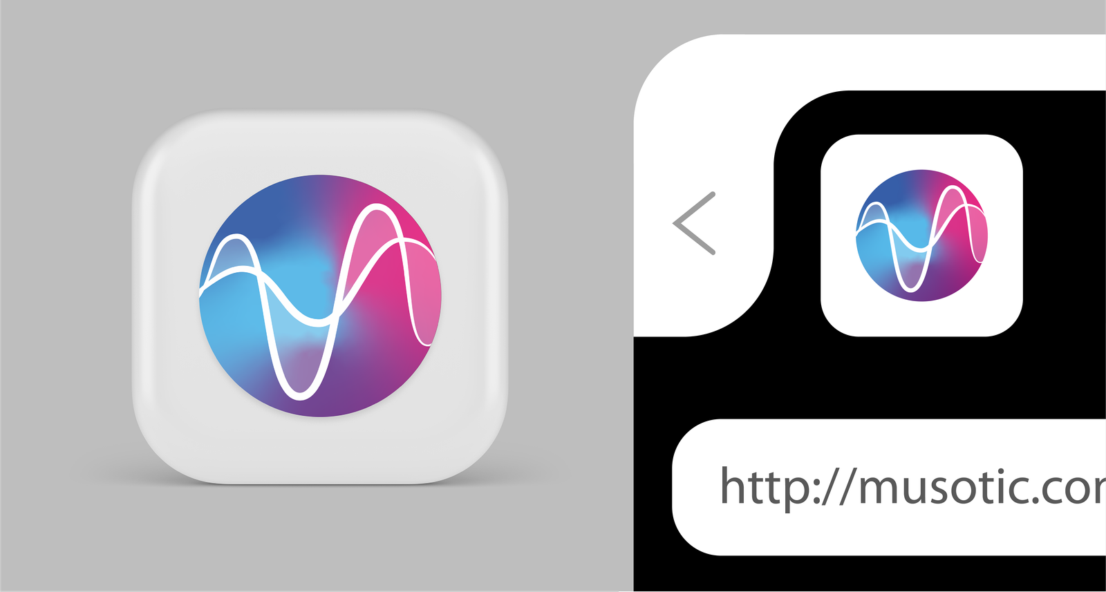
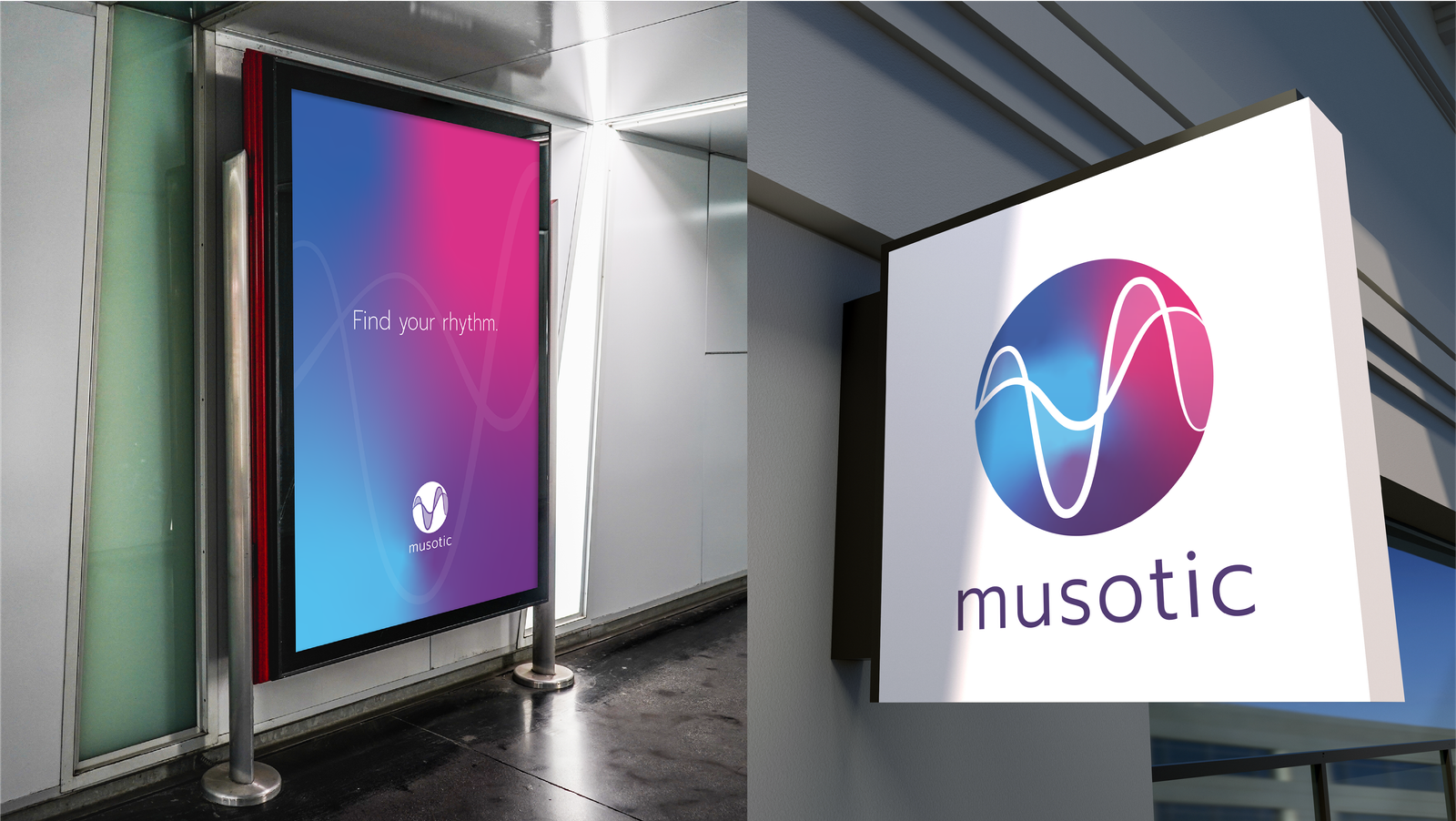
US English. We dove deep into the music platforms and the current design trends associated with the music industry. The core idea of the logo is a wave, which represents a sound wave. But more than that - the interplay between the two waves creates a subtle sense of a surface between them, making the icon appear to have depth and three dimensions. The interconnectedness between the two waves is what keeps them floating together, even though they are different. These two waves represent two people listening to the same music tune but having different experiences – the experiences that they will share with one another (on Musotic platform, of course). It is a wavelength of a social vibe – the symbol of a connection between people – that is at the core of Musotic.
The waves also mean fluid continuity – a reflection of music experiences and social connections that never stop but continue and grow over time thus connecting to the listener on a deeper intuitive level. Find your rhythm on Musotic!


