Glatchi Construction – architecture of rebranding
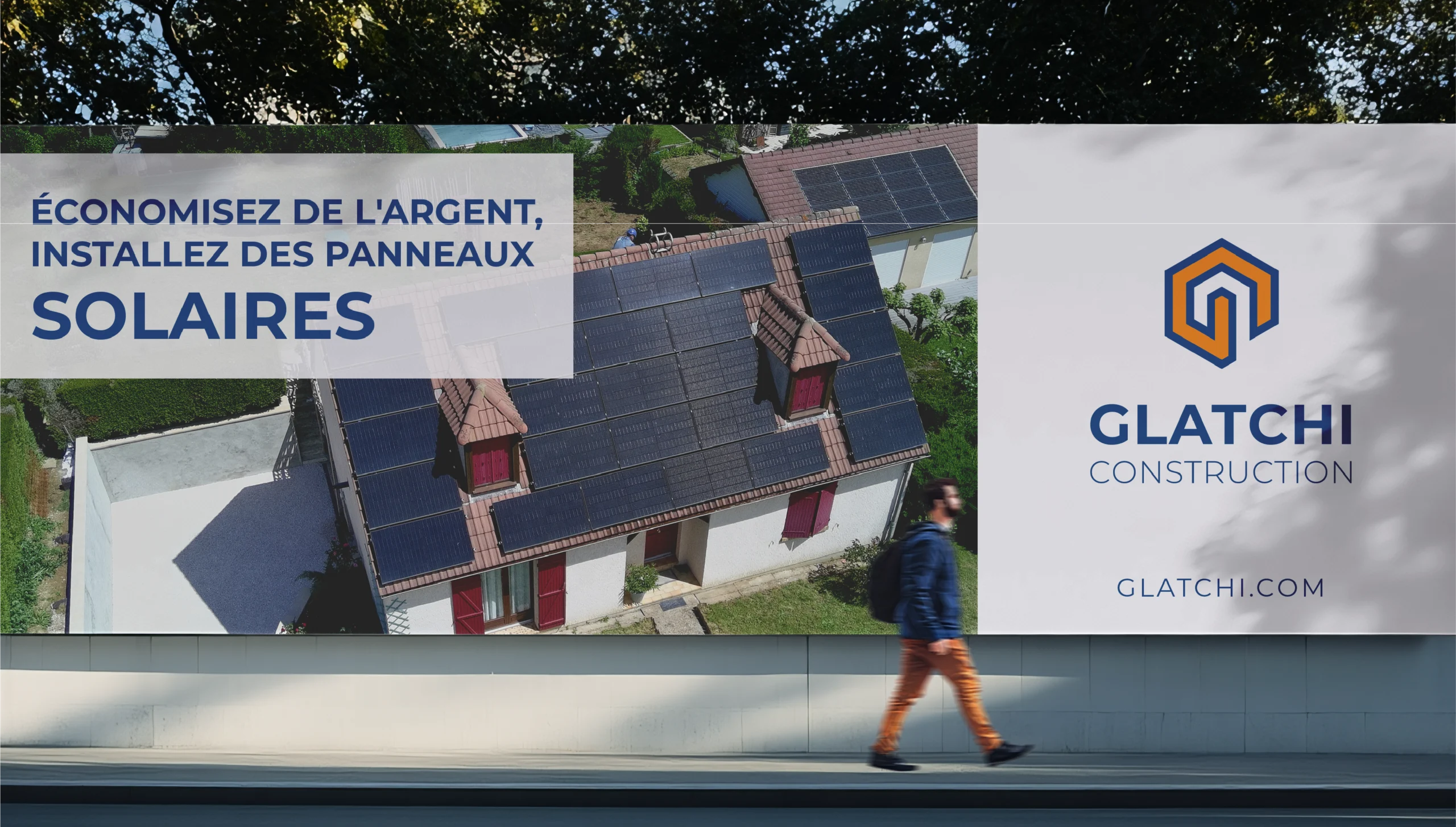
Glatchi Construction is a national French solar panel installation company based in Paris.
The company had a problem – they relied on one energy conglomerate for most of the business. As a subcontractor, they had little control over the projects and small profit margin. They needed to build an independent retail division.
In building the strategy, we started with high-quality, sustainable energy solutions. The business model emphasized efficiency, reliability, and environmental responsibility. But a human factor was missing. And we needed to bring it in.
What our research showed was that Glatchi guys worked with the clients on site. They would pause, explain, show, reassure, and have a coffee with the owner – the human component that made the service wholesome and complete. We needed to reflect this wholesomeness in the brand identity. Care – not commodity – became the clear unique value that the company brought to the French homes.
Brand Identity Concept
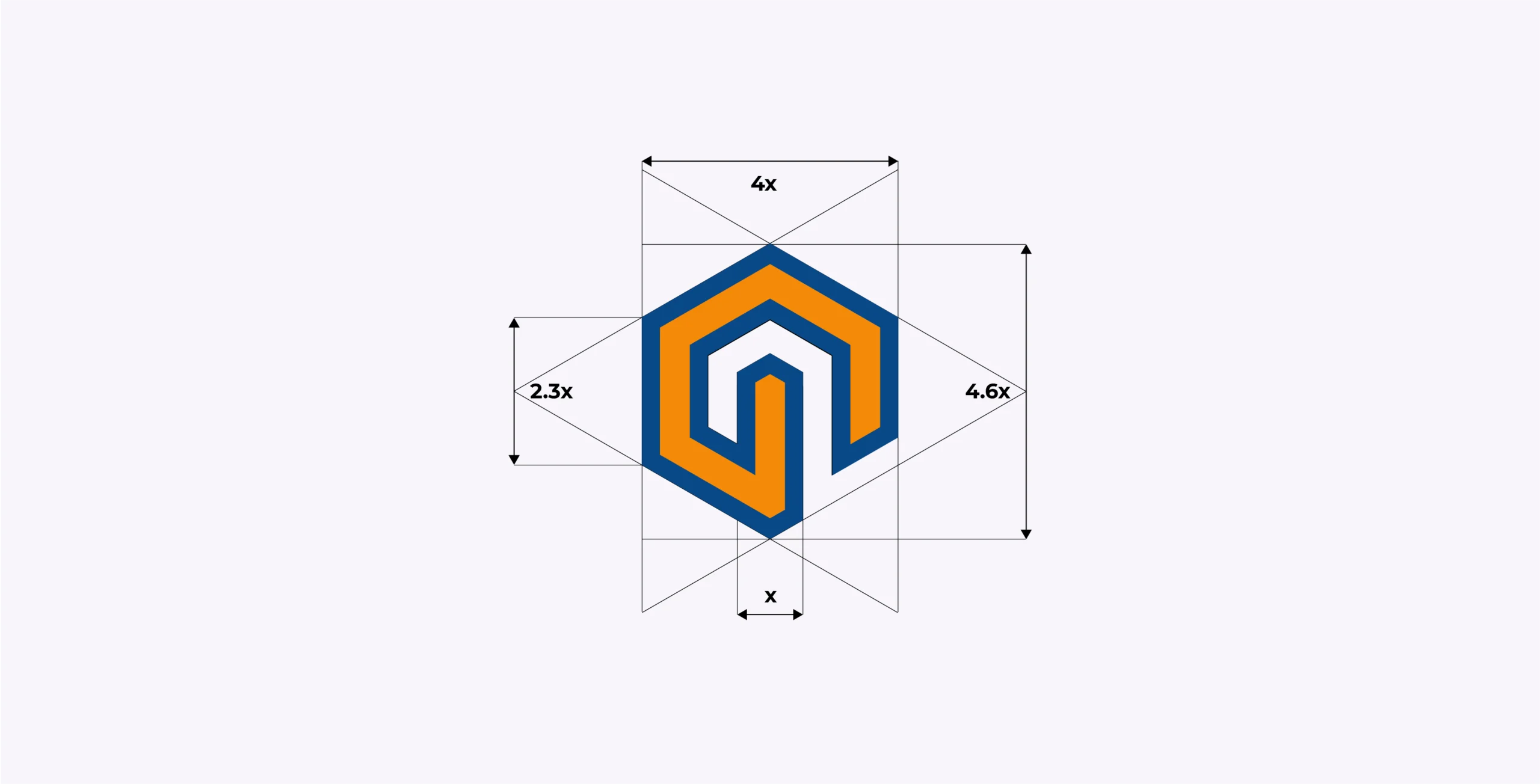
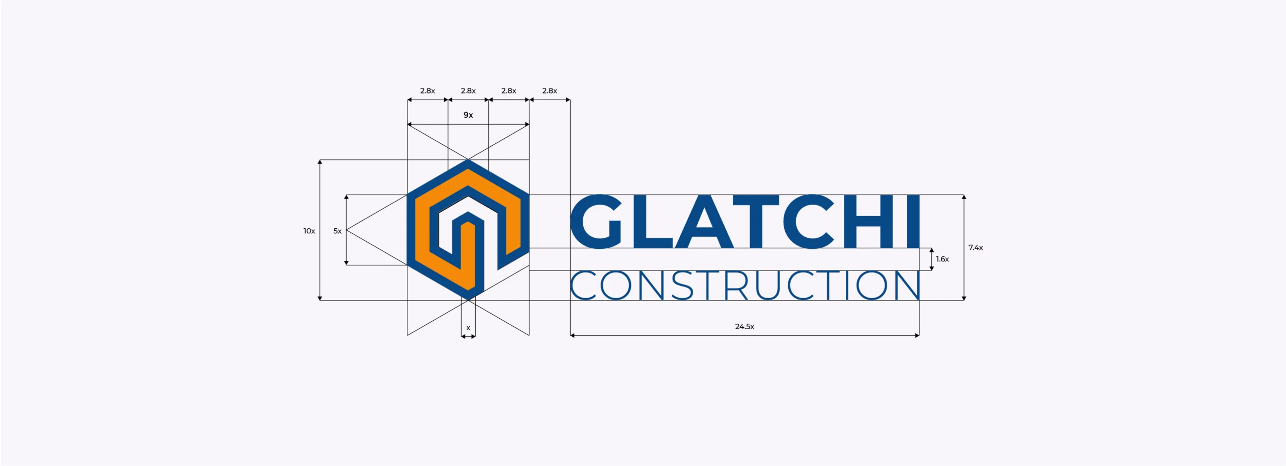
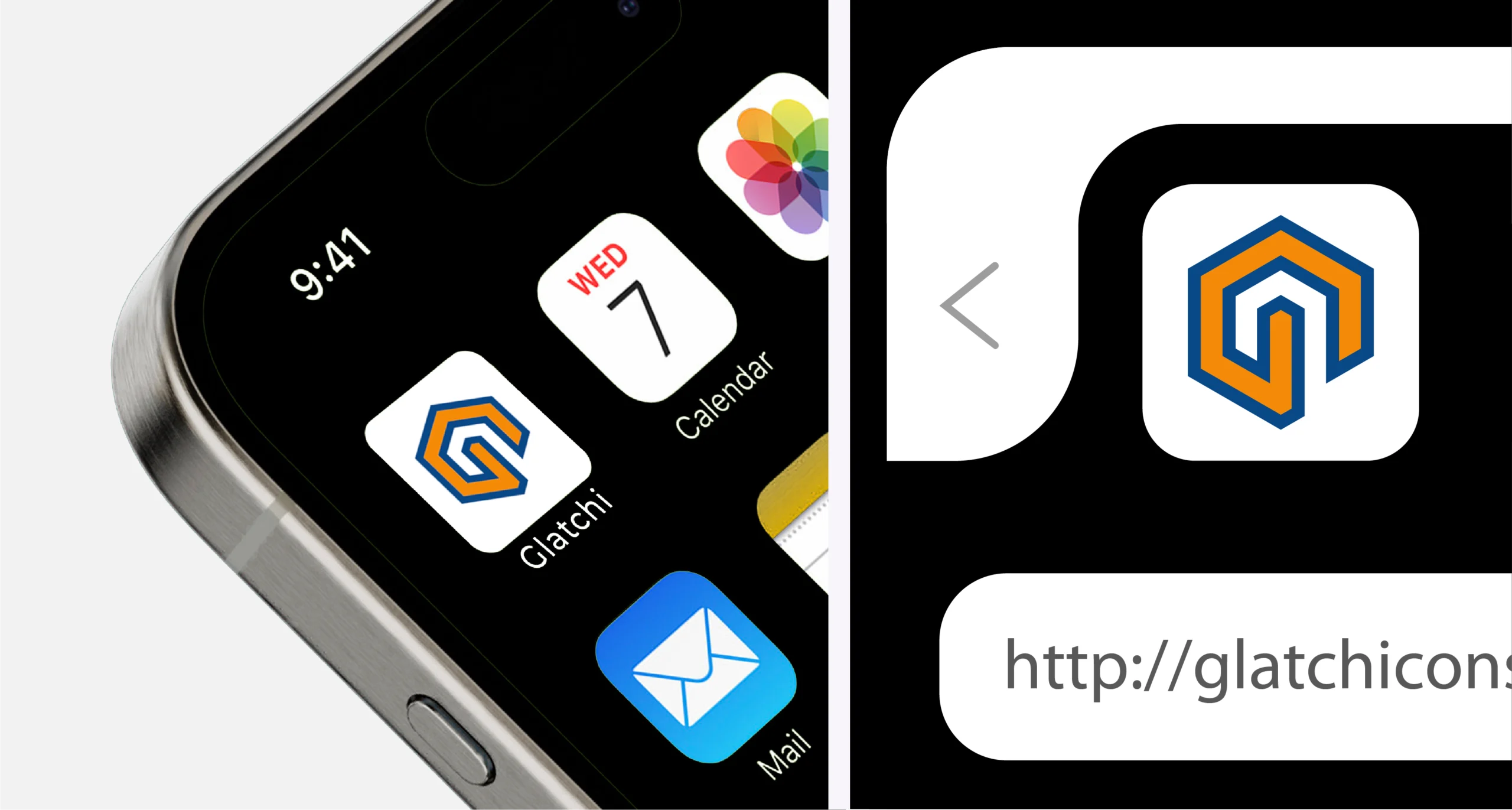
We built the logo using geometric principles, reinforcing confidence and stability. Using negative space, we created an image of a house protected by the overarching rotated letter G that also hinted at the honeycomb and created a 3D-effect with the perspective toward the house, symbolizing the eco-friendly future.
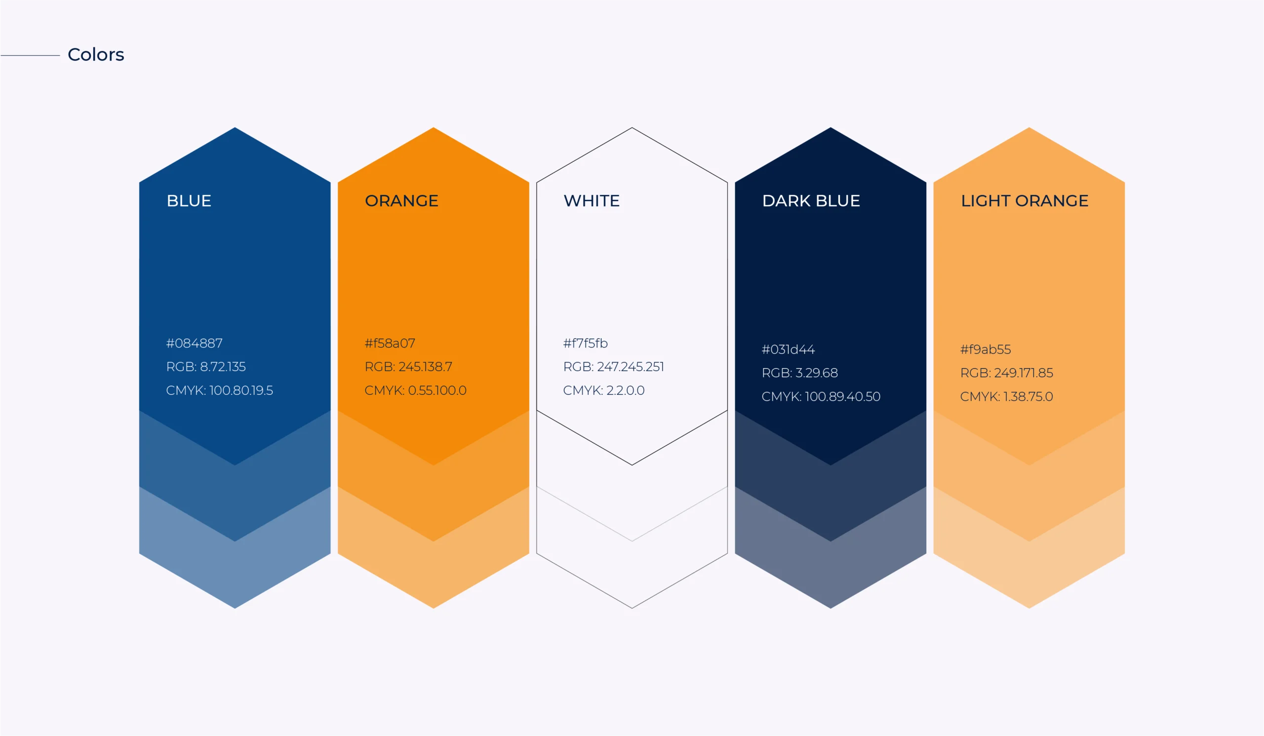
Color Palette
The selected corporate colors highlight environmental consciousness and technological advancement:
▫️ Blue representing the sky and solar panels.
▫️ Orange symbolizing the energy of the sun.
These colors create a balance between trust, sustainability, and innovation, reinforcing Glatchi Construction’s positioning in the renewable energy sector.
After the rebranding, the company was able to lift the retail revenue from less than 5% to 40% in 9 months while increasing the profit margin on the direct contracts.